Skip to content
Cursive Alphabet

Types of Cursive Handwriting

Cursive is a family, not a single alphabet. A grandparent’s Palmer hand, a child’s D’Nealian worksheets and an engraved Spencerian invitation are all cursive, and they disagree about a surprising number of letters — the capital Q is the famous one.

Three kinds of cursive

Every named style below belongs to one of three broad kinds, sorted by how letters join.

Looped

loop in looped cursive

Tall letters and descenders carry loops so the pen never has to leave the paper. This is what most people mean by cursive, and it is the style on this site.

Connected

connect in looped cursive

Letters are joined by connecting lines, with loops only where a join needs one.

Italic

No loops at all. Letters join with short straight strokes, some are not joined, and nothing joins after g, j, q or y.

The styles, oldest to newest

Palmer stripped Spencerian down for speed. Zaner-Bloser then split print and cursive into two alphabets, and later programs have tried to close that gap.

Spencerian

The main American handwriting method from the 1840s
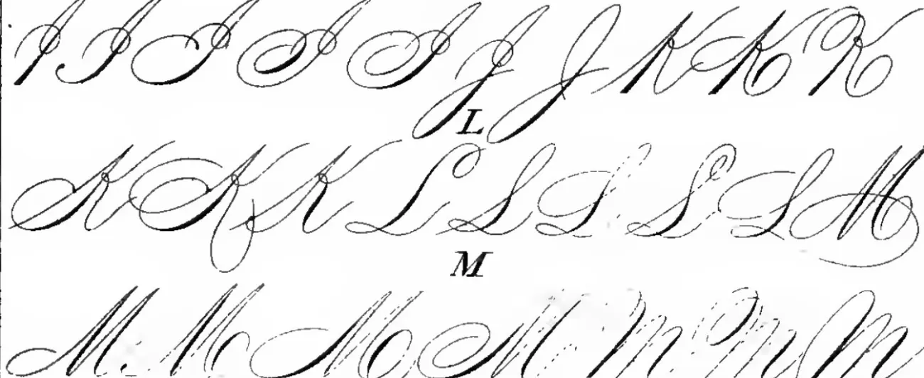
Engraved Spencerian capitals I, J, K, L and M, several variants of each, with thick shaded downstrokes
Capitals I to M from the Spencerian Key to Practical Penmanship. Public domain.

Where it came from

  • Created by Platt Rogers Spencer, a bookkeeper who wanted one uniform hand anyone could learn; after his death his sons published the Spencerian Key to Practical Penmanship, which became the standard textbook.
  • Taught with a combined arm-and-finger movement.
  • It is the loopy hand of diplomas and old wedding invitations, and the ancestor of the original Coca-Cola logo. Today it survives as calligraphy rather than as a school subject.

How to recognise it

  • Oval-based letters on a steep slant — the Spencerian Key marks its slant at 52°.
  • Thick downstrokes and hairline upstrokes (shading), drawn with a pointed pen.
  • Ornate capitals, each with several variants.
Palmer Method

Developed around 1888; the most popular US system for half a century

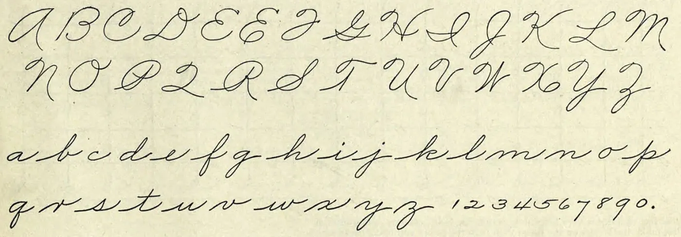
The Palmer Method capitals A to Z, lowercase a to z and the figures 1 to 0, written in a plain unshaded hand
The whole alphabet from The Palmer Method of Business Writing. Public domain.

Where it came from

  • Austin Norman Palmer, a penman in Cedar Rapids, Iowa, published Palmer's Guide to Business Writing in 1894.
  • New York City's schools adopted it after seeing Palmer demonstrate at the St. Louis World's Fair in 1904, and districts across the country followed; in 1912 alone the textbook sold a million copies.
  • Its point was speed: writing from the arm, not the fingers — “muscular movement” — so a clerk could keep up with the typewriter. Students drilled rhythmic ovals alongside their letters.
  • It began to fade in the 1950s as schools moved to Zaner-Bloser, and the Palmer company stopped publishing in the 1980s.

How to recognise it

  • Plain and unshaded: the flourishes of Spencerian stripped out, capitals simplified.
  • The capital Q is shaped like the numeral 2, and the lowercase z drops below the line with a loop.
  • Written with a coarse pen, so every line has the same weight.

Zaner-Bloser

From the Zanerian College of Penmanship in Columbus, Ohio; the teaching script took shape around 1904

Where it came from

  • By the middle of the 20th century it was the most widely taught handwriting in the US, taking over from Palmer.
  • Children learn an upright print first, then a separate slanted cursive — two different alphabets, which is the transition later programs tried to smooth.
  • Still published today, running from print in kindergarten to cursive through grade six.

How to recognise it

  • A slant of about 25°.
  • Long exit strokes that run all the way up to the midline — which can make l look like b and u look like w.
  • p has a loop; the crossbar of t sits a little above the midline; e has a straight back, like a small l.
  • The capital Q ends under the baseline and does not join the next letter. Older editions looped their capitals; the current one drops those opening loops.

D'Nealian

Introduced in 1978

Where it came from

  • Created by Donald Neal Thurber, a Michigan teacher, to fix the print-to-cursive jump: its print is already slanted, and most print letters end in a small tail.
  • Moving to cursive mostly means connecting the tails. Only 13 letters change shape between D'Nealian print and D'Nealian cursive, and the slant does not change.

How to recognise it

  • A gentler slant of about 17°.
  • Short exit strokes, often called “monkey tails”.
  • p is a straight stick; the crossbar of t sits on the midline; e has a round back, like c and o.
  • The capital Q is open on the left, so it looks like a 2 — and unlike Zaner-Bloser's, it joins the next letter.

Handwriting Without Tears

Now published as Learning Without Tears

Where it came from

  • Created by an occupational therapist, Jan Olsen, and built around how young children's hands develop. It is known for its simple two-line paper.
  • Taught from kindergarten to fourth grade.

How to recognise it

  • Upright — no slant at all.
  • Simplified letters that stay close to print, though e, f and k change form in cursive.

New American Cursive

A newer, simplified program

Where it came from

  • Written to be easier to learn: fewer strokes, simpler capitals, and a light slant to the right.

How to recognise it

  • Capitals such as R, K, P and Z start without the small lead-in curve older styles use.

CursiveLogic

Designed first for adult learners

Where it came from

  • Developed by Linda Shrewsbury, who noticed that most lowercase letters fall into four shared shapes and taught them as four colour-coded “strings”: ovals, loops, swings and mounds.
  • It assumes the learner can already print, which is why it suits older children and adults.

How to recognise it

  • The ovals string, for example, is a, c, d, g, q and o — learned together as one movement.

Italic (Getty-Dubay)

A modern revival of Renaissance italic

Where it came from

  • Developed by Barbara Getty and Inga Dubay. Children learn one slightly slanted italic print, and cursive italic is the same alphabet with joins added — no second alphabet to learn.
  • Their adult book, Write Now, is a common recommendation for grown-ups fixing messy handwriting.

How to recognise it

  • No loops. Short diagonal and flat joins, and sensible pen lifts inside words.

Zaner-Bloser vs D’Nealian, letter by letter

The two long-running American school programs. Their lowercase letters are nearly the same; the differences are in the details below, and they matter most when a child switches programs.

Zaner-BloserD’Nealian
SlantAbout 25°About 17°
Exit strokesLong, up to the midlineShort “monkey tails”
Lowercase pLoopStraight stick
Crossbar of tA little above the midlineOn the midline
Lowercase eStraight backRound back
Capital QEnds below the baseline, does not joinOpen like a 2, joins
Humps of capital M and NStop below the top lineTouch the top line
Print before cursiveUpright print, then a new slanted alphabetSlanted print with tails; 13 letters change
The thing you look for is how they write letters such as Q, Z/T, and R when you decide.

— a homeschooling parent comparing programs, on Guavarama

Where this site’s letters fit

The letters here are looped cursive with a right slant, drawn from the open-licence Sacramento typeface rather than copied from any school program — the two big school programs do not sell their fonts. The capital Q is a closed oval rather than a 2, the p has a narrow loop, and many capitals start with a small lead-in curl.

If your child’s school uses Zaner-Bloser or D’Nealian, follow the school’s shape for the few letters that differ. For the rest, the stroke order on each letter page — where to start, which way to go round — still applies: the styles differ in details more than in how the pen moves through a letter.

Queen in this site's cursive

The capital Q on this site: a closed oval with a tail, not a 2.

Reading old family letters? Older ones are often Spencerian or Palmer — see how to read cursive for the abbreviations and letterforms that trip readers up.

Questions about cursive styles

What are the three types of cursive?

Looped, connected and italic. Looped cursive puts loops on tall letters and descenders so the pen stays down; connected cursive joins letters with lines and uses loops only where needed; italic has no loops and does not join every letter.

What are the four types of cursive writing?

There is no official list of four. The four styles still in use that come up most are Spencerian, the Palmer Method, Zaner-Bloser and D'Nealian — the first two historical, the last two long-running American school programs.

When did they stop teaching the Palmer Method?

Gradually. It began to lose ground in the 1950s as schools switched to Zaner-Bloser, at least one school kept teaching it into the 1960s, and the Palmer company stopped publishing in the 1980s.

What is the newest cursive style?

No single one. Handwriting Without Tears and New American Cursive both simplify capitals and cut extra strokes, and Handwriting Without Tears drops the slant altogether, so cursive stays close to the print children already know. CursiveLogic changes how the letters are taught rather than how they look.

Which type of cursive is the hardest?

Spencerian is widely described as the most demanding: steep slant, shaded strokes and ornate capitals. The Palmer Method is plain to look at but hard to do properly — writing from the arm rather than the fingers takes six months to a year of steady practice, by one penmanship site's count.

Which cursive should I learn?

If a child is in school, the one the school teaches — two styles at once is the thing that causes trouble. Otherwise pick one and stay with it. The differences are a handful of letters; switching back and forth costs far more than any style's quirks.

Ready to start? The beginner’s guide covers the strokes every style shares, and adults relearning can start with cursive for adults.